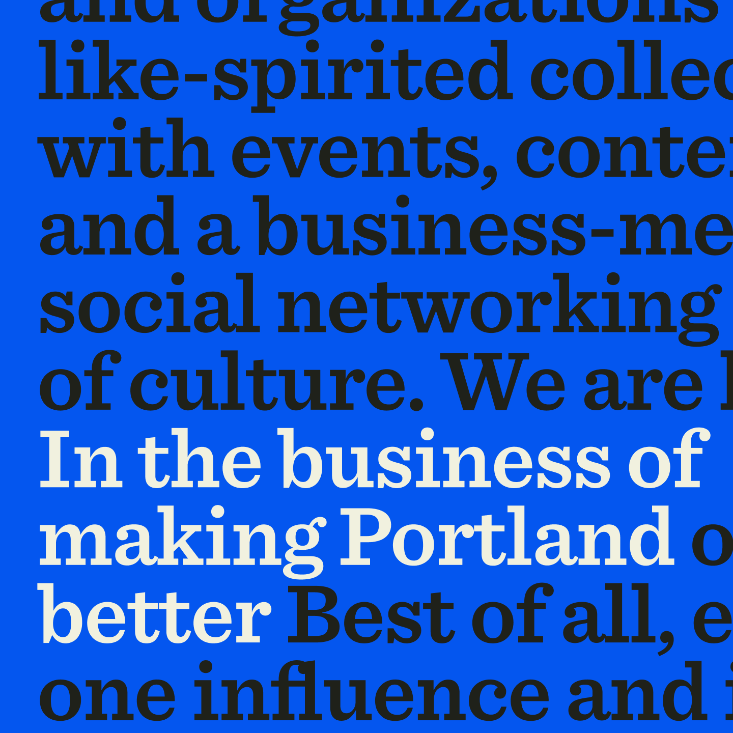
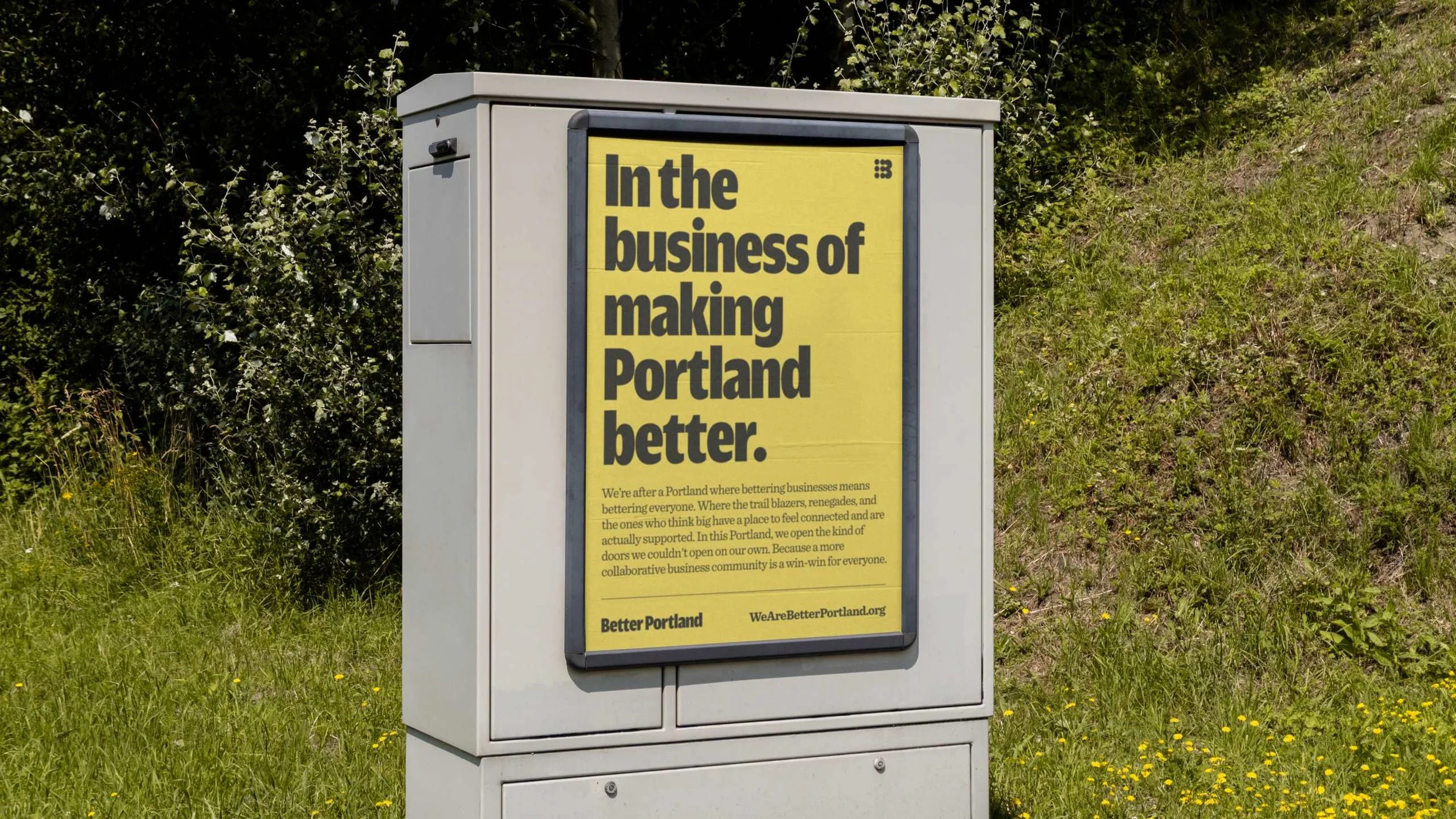
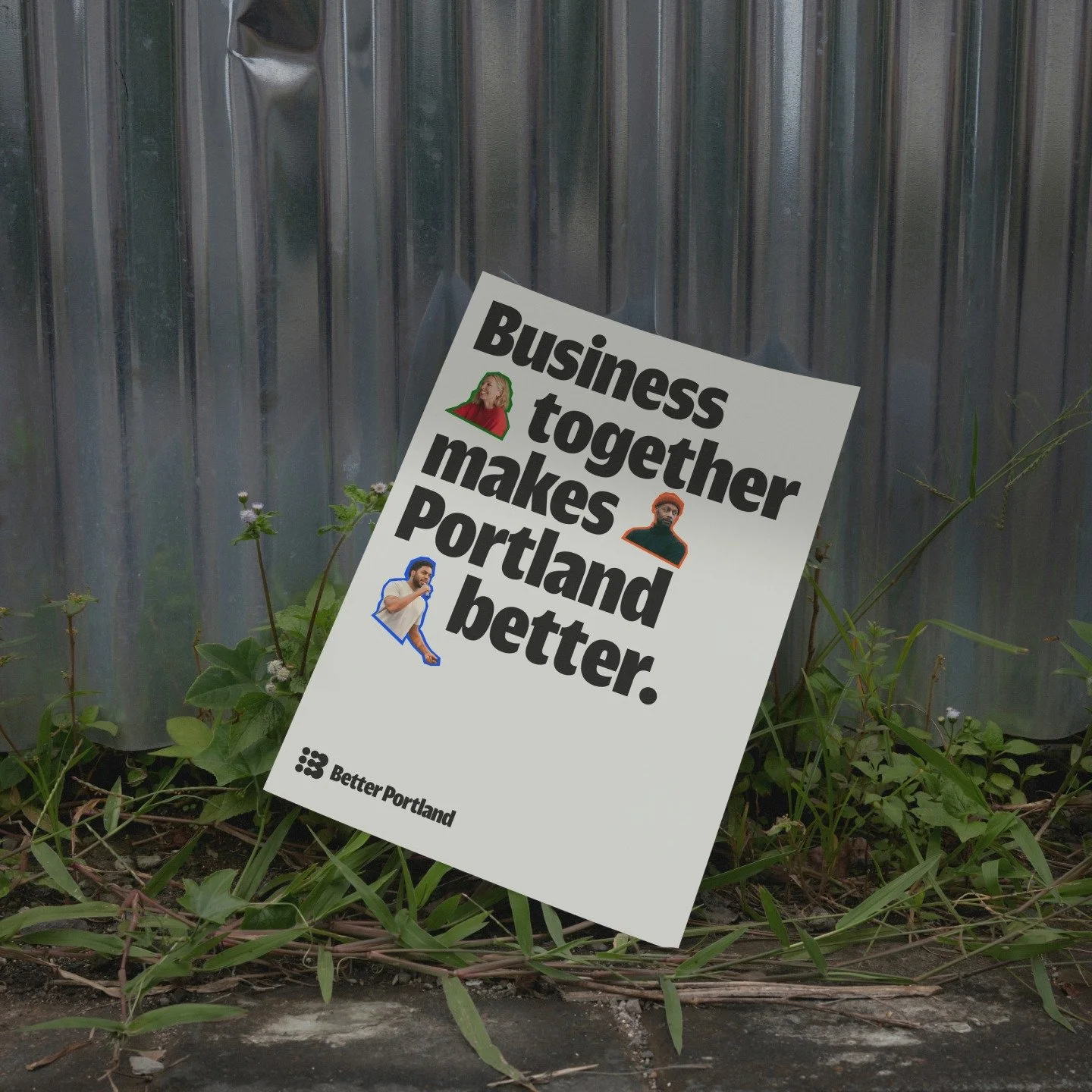
Better Portland works to advance the growth and impact of the Portland community by fostering clarity in its mission and creating positive, engaging change.
-
SITUATION
Better Portland approached us with a request to help rethink and relaunch their organization following several significant changes. The most pivotal change was the appointment of a new Executive Director, Stephen Green. Stephen, known for his visionary leadership, aimed to prepare Better Portland for the next decade of growth and impact, ensuring the organization could adapt to the evolving needs of the community it serves.
PROBLEM
Despite having a steadfast mission, Better Portland's positioning and messaging lacked clarity and coherence. The board frequently struggled to succinctly and clearly communicate the organization's purpose to stakeholders, partners, and the community. Additionally, the general public often found their previous name, "Business for a Better Portland," hard to pronounce and remember, which hindered engagement and support.
SOLUTION
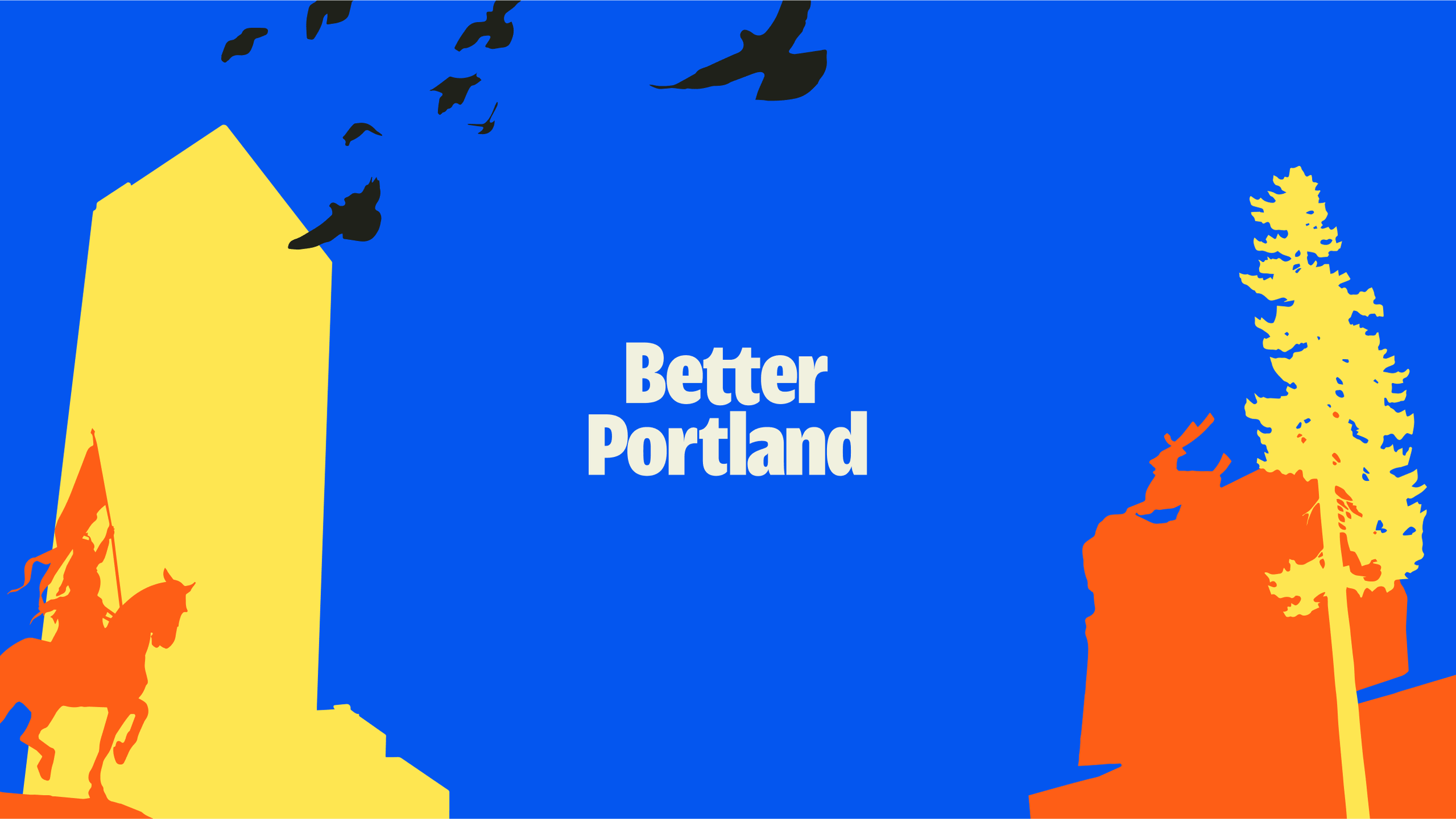
We embarked on a comprehensive rebrand initiative, meticulously reconstructing the brand from its core foundation: brand name, mission, vision, values, tone and voice, brand visual system, and a completely new website. This process involved deep collaboration with the board and key stakeholders to ensure every aspect of the brand resonated with their goals and objectives. One of the greatest achievements was the clarity we provided, which empowered the board members to confidently articulate what Better Portland stands for, its purpose, and how it plans to make a lasting impact on the community. The new branding elements were designed to be memorable, engaging, and reflective of the organization's renewed commitment to growth and positive change.
Stage
Early
Industry
Non-Profit
Civic
Impact Focus
Social
Services
Brand Strategy
Brand Sprint
Website Sprint